Building the postie journey
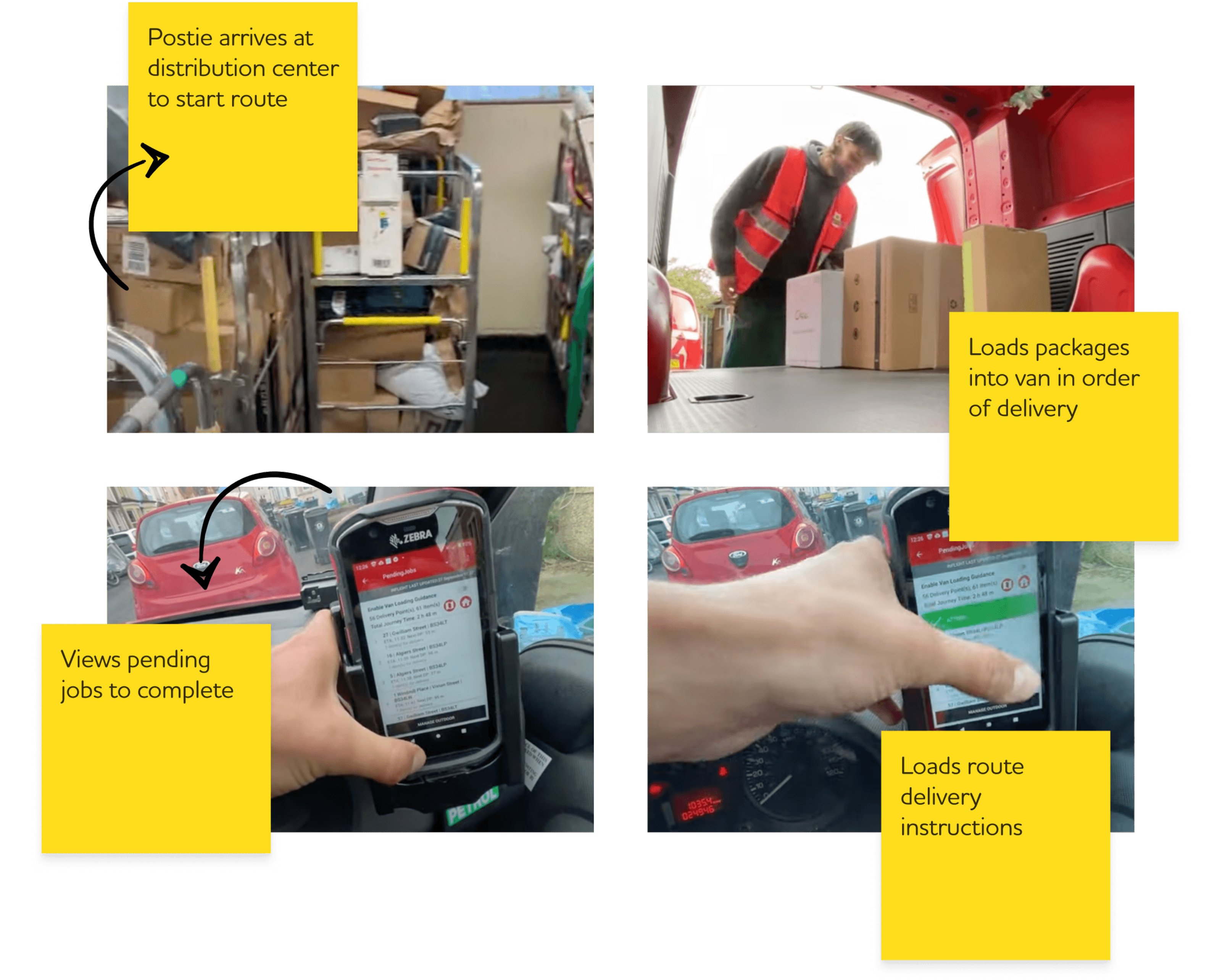
We structured the journey into key phases: Arrival, Loading, Route Prep, Takeoff, En Route, Delivery, and Wrap-Up. While the audit provided a foundation, these phases were primarily shaped by how Rowan and other posties navigated their daily deliveries.


After watching Rowan’s “day in the life” videos, we pivoted to framing the problem as a journey map. This approach helped us consider both postie and Royal Mail actions, identify pain points, and uncover opportunities. By applying a service design mindset, we were able to move beyond a traditional audit and present Royal Mail with a fresh perspective.
Auditing the current postie experience
The initial request focused on auditing their current experience — identifying gaps and pain points in day-to-day use. The Royal Mail team shared screenshots of the app and guided us through its functionality. However, we wanted to go beyond static images and connect directly with real users to gain deeper insights.
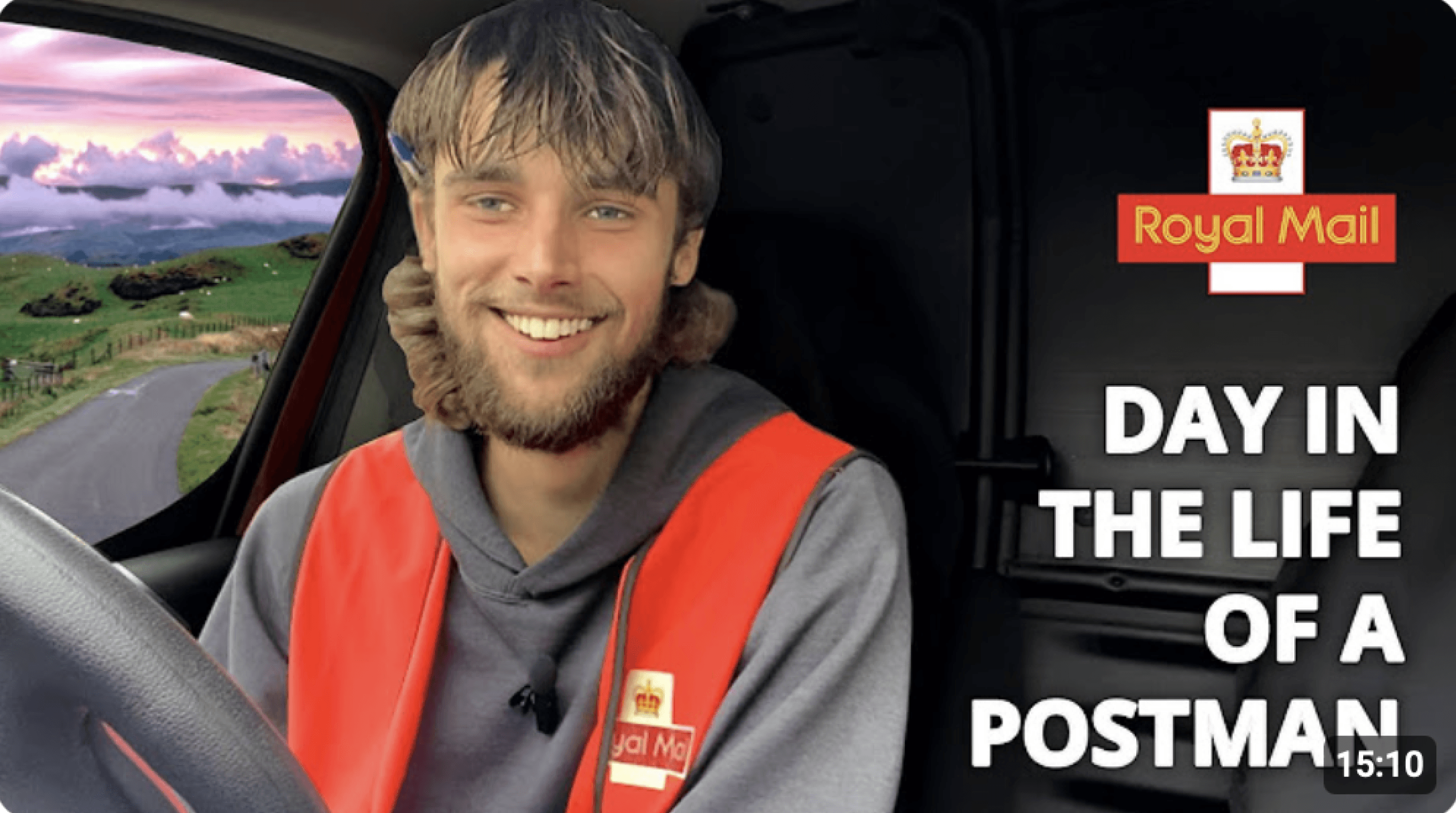
Since there wasn’t time for formal user research, we made use of what was available — in this case, YouTube.
(Thanks, Rowan the postie!)


©️ Claire Lorman 2025
Royal Mail RFP: Imagining an improved day to day postie experience
Royal Mail’s postmen (aka "posties") have been using the same internal system for years. It became clear that many were struggling with it, and there was significant potential to improve efficiency. The team wanted to explore whether the existing app could be modernized and streamlined – we explored the potential via an RFP.
PROJECT OVERVIEW
Lead
ROLE
1 lead
1 midweight
1 junior
DESIGN TEAM
2 weeks
TIMING
We began realizing our concepts through low-fidelity designs, which we used as a tool to demonstrate our vision within the RFP. We felt this approach showed our thinking in a new and unique way — and gave potential clients a chance to see our process.
Building the postie journey
We structured the journey into key phases: Arrival, Loading, Route Prep, Takeoff, En Route, Delivery, and Wrap-Up. While the audit provided a foundation, these phases were primarily shaped by how Rowan and other posties navigated their daily deliveries.
Post low-fi exploration, we did multiple rounds of higher fidelity to explore how best to use Royal Mail's design language across the screens. We wanted to ensure that our chosen direction highlighted simplicity and ease of use, something that posties aren't getting at the current moment.
Impact
Although it was originally developed for an RFP, our approach to mapping the postie’s journey quickly proved valuable and was adopted across a range of client projects — ultimately becoming a standard way of working within the studio, helping us consistently deliver more actionable and user-focused outcomes.


Royal Mail RFP: Imagining an improved day to day postie experience
Royal Mail’s postmen (aka "posties") have been using the same internal system for years. There was significant potential to improve efficiency; we explored via an RFP whether the existing app could be modernized and streamlined in any way.
PROJECT OVERVIEW
Lead
ROLE
1 lead
1 midweight
1 junior
DESIGN TEAM
2 weeks
TIMING
Auditing the current postie experience
The initial request focused on auditing their current experience — identifying gaps and pain points in day-to-day use. The Royal Mail team shared screenshots of the app and guided us through its functionality. However, we wanted to go beyond static images and connect directly with real users to gain deeper insights.
Since there wasn’t time for formal user research, we made use of what was available — in this case, YouTube.
(Thanks, Rowan the postie!)
After watching Rowan’s “day in the life” videos, we pivoted to framing the problem as a journey map. This approach helped us consider both postie and Royal Mail actions, identify pain points, and uncover opportunities. By applying a service design mindset, we were able to move beyond a traditional audit and present Royal Mail with a fresh perspective.
We began realizing our concepts through low-fidelity designs, which we used as a tool to demonstrate our vision within the RFP. We felt this approach showed our thinking in a new and unique way — and gave potential clients a chance to see our process.


Post low-fi exploration, we did multiple rounds of higher fidelity to explore how best to use Royal Mail's design language across the screens. We wanted to ensure that our chosen direction highlighted simplicity and ease of use, something that posties aren't getting at the current moment.


Impact
Although it was originally developed for an RFP, our approach to mapping the postie’s journey quickly proved valuable and was adopted across a range of client projects — ultimately becoming a standard way of working within the studio, helping us consistently deliver more actionable and user-focused outcomes.